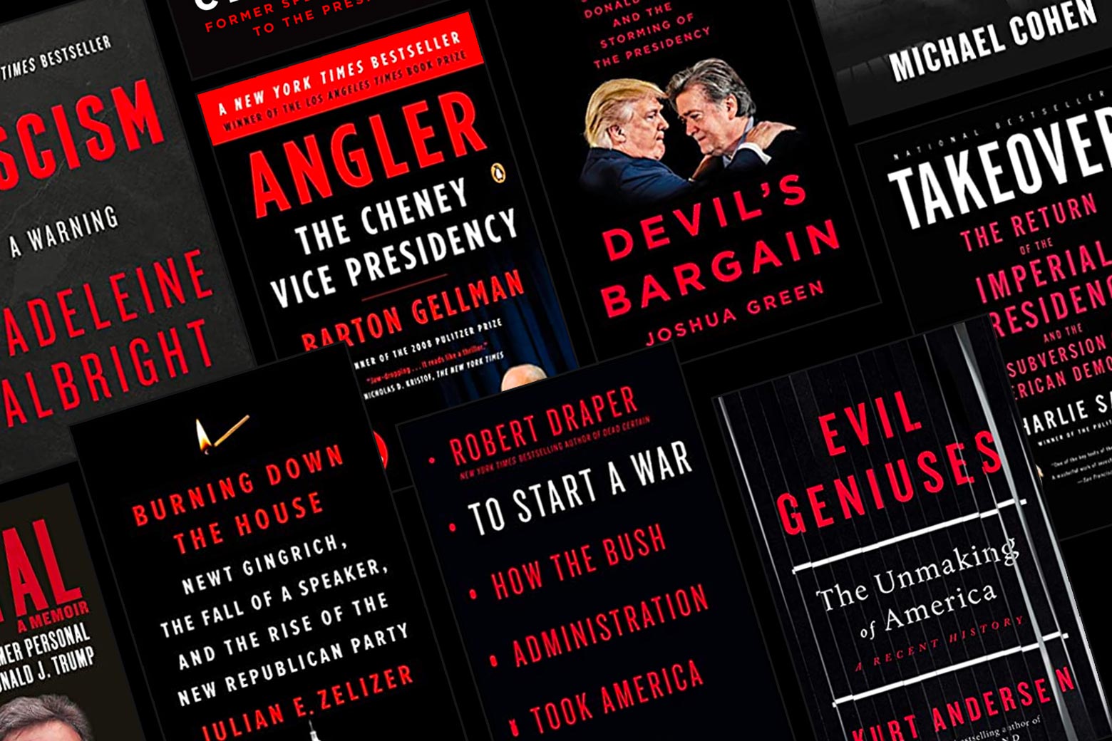
Got a Very Serious Book to sell about the dangers of radical right-wing overreach? In book publishing, this is the summer of the Sith Lord design palate. Just in the past two months, three high-profile new books—Kurt Andersen’s Evil Geniuses (on the conservative movement since the 1970s), Robert Draper’s To Start a War (on the Bush administration’s invasion of Iraq), and Julian Zelizer’s Burning Down the House (on Newt Gingrich)—have all hewed close to this same look. It’s characterized by an imposing black background with a combination of red-and-white, boldface, sans-serif font. (As if in an accidental homage to “Separated at Birth,” the Andersen-edited Spy magazine feature, New York Magazine’s Approval Matrix recently featured the Draper and Zelizer books nestled right near each other in the highbrow-brilliant quadrant.)
And next week, Michael Cohen’s Disloyal, a tell-all about his years working for Donald Trump, will go out to stores with a fittingly downmarket version of the same look.

This isn’t an entirely new trend. I’m working on the next season of Slate’s Slow Burn, about the leadup to the Iraq War, and in the course of my research for the podcast, my desk started to pile up with books whose dust jackets similarly featured Darth Vader’s favorite colorway. I begin to think of this loose template as “the Angler cover,” after Pulitzer winner Barton Gellman’s 2008 biography of Dick Cheney, which became a best-seller. There was the Draper book, and 2007’s Takeover: The Return of the Imperial Presidency, by Pulitzer winner Charlie Savage, and Joby Warrick’s Pulitzer-winning Black Flags: The Rise of Isis. I started to notice Angler-style covers everywhere. On Devil’s Bargain, Joshua Green’s No. 1 New York Times bestseller, about Steve Bannon. On Fascism: A Warning, by former Secretary of State Madeleine Albright, which also topped the bestseller list.
Of the look, a book designer told me that the colors are simply grabby (“there are only so many colors we have … and these are just the most serious colors we have in the crayon box”), and this sort of refined but bold design telegraphs ambition. Editors, the designer says, always believe a “big book has to look like a big book.” Several of the Sith Lord books share the same publisher, Penguin Press, which publishes a lot of serious nonfiction, and the cleanest, simplest execution of the look seems to come from that house. The designer also suggested to me that the Patient Zero for this oft-imitated design style was Penguin’s 2004 Pulitzer winner Ghost Wars, by Steve Coll, which seemed to establish a visual language for the ambitious work of journalism about the world that 9/11 made. (Coll’s 2018 book Directorate S comes wrapped in another, slightly more fanciful riff on the look.)
It makes a certain kind of intuitive sense that the Sith Lord palate would have taken off in the years of the Bush administration’s War on Terror and returned in earnest when Trump was elected. The colors are the American flag in mourning, the more tranquil blue blotted out by black. The whole look is one of warning, of red-alert. The red, white, and black color scheme is echoed, in a less spare and streamlined look, in some of the Resistance-aimed, less journalistically rigorous barnburners of the past few years, like Cliff Sims’ Team of Vipers or Michael Wolff’s Siege.
Meanwhile, on balance, big political books of the Obama years—even the ones about the financial crisis—tend to come in jauntier packaging. Red beats out black, blue shows up, and white gets to be the background rather than the font color. (One exception is Jonathan Chait’s book Audacity, which has a very Angler-y vibe—but while it was about Obama, it was published at the dawn of the Trump years, which seems to have cast a shadow. Still, there’s a trace of Democratic blue.) This may, of course, simply reveal the worldview of the publishers and journalists and the readers to whom the books are marketed.
One of the more interesting twists on the Angler cover is Clinton Cash, the right-wing book that author Peter Schweizer (along with his longtime collaborator Steve Bannon) deliberately and explicitly intended to be the kind of investigation that wouldn’t just ping around the Fox News-sphere but would also infiltrate the pages of the mainstream media. I wouldn’t be surprised if the cover choice, in the visual vernacular of ambitious journalism, was deliberately selected to help that mission along.
The book designer I spoke to told me it’s relatively common practice in an initial brainstorming meeting to look to a recently successful book on a similar subject area and try to do a new riff on it. For what it’s worth, Draper, Gellman, and Andersen all told me that their covers weren’t designed as any kind of deliberate homage to another author’s book or reference to a certain color scheme. (“No one was ferociously advocating the red/black motif,” Draper said, suggesting that instead it might have been—as Paul Wolfowitz famously said of weapons of mass destruction as a reason for going to war—the one thing “everyone could agree on.”)
I asked Andersen if there’s anything annoying about having a book that looks so much like others on the market. “No, no! It’s the Zeitgeist,” he replied. “And to tell the truth, in the age where people buy books online, that sense of ‘Oh look, the book on the shelf here looks like that other one,’ … I think people are less aware.”
"book" - Google News
August 31, 2020 at 04:44PM
https://ift.tt/2G8aP1D
How Political Books Got Their New Favorite Look - Slate
"book" - Google News
https://ift.tt/2Yv0xQn
https://ift.tt/2zJxCxA
Bagikan Berita Ini


0 Response to "How Political Books Got Their New Favorite Look - Slate"
Post a Comment